KiddiMath Website
Establishing a joyful and professional brand presence with vibrant visuals, structured content, and responsive design.
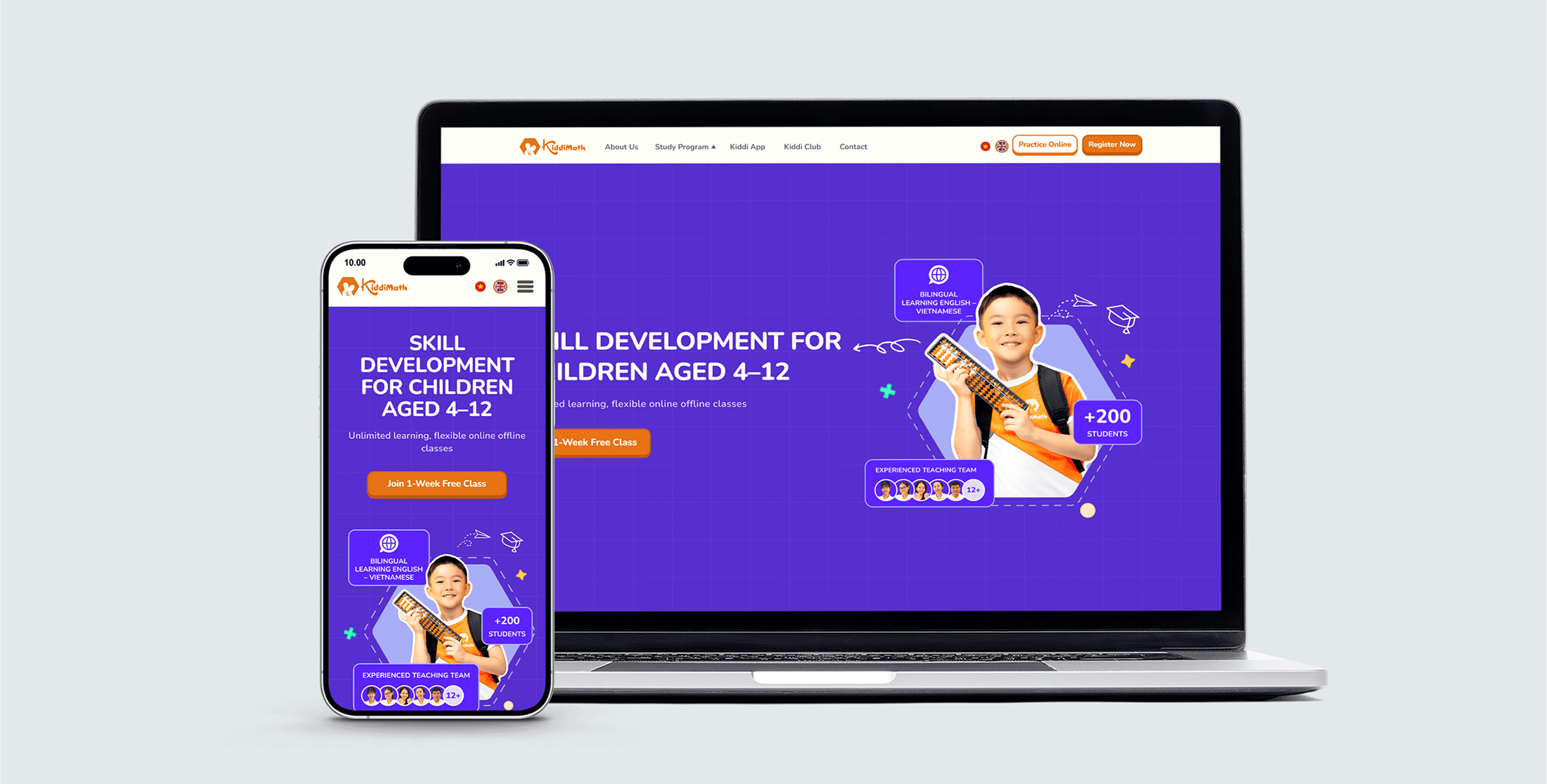
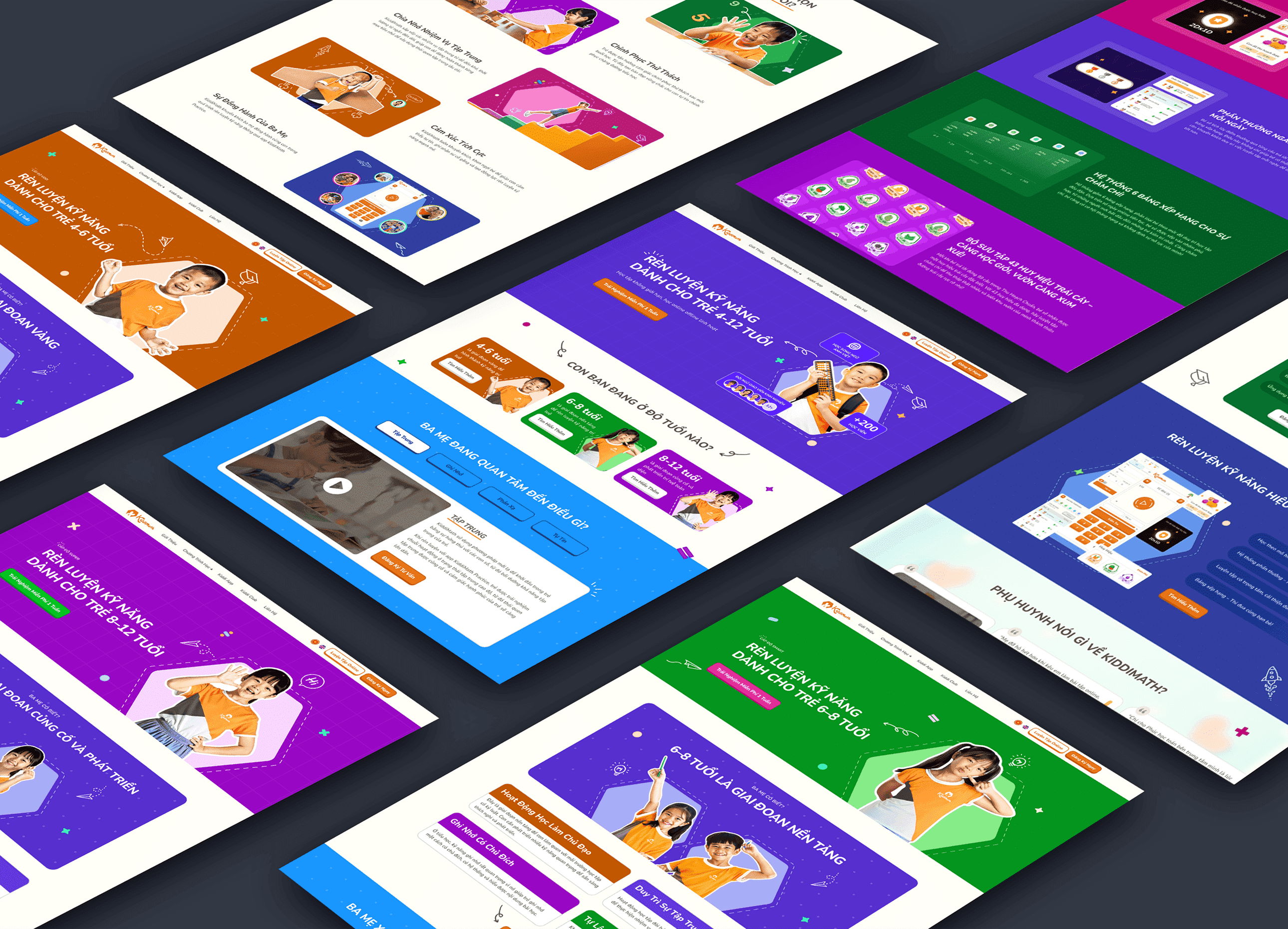
A Playful New Look
KiddiMath is a learning center that teaches mental math to children aged 4–12. As a former teacher there, I understood their values and how to communicate them clearly — especially to parents. They brought me on to redesign their website with a playful visual identity that also made key information easier to find.
The project began with just a logo, so I developed the entire visual direction from scratch — including layout, color palette, and graphic elements. The content was also dense and unstructured, so I focused on distilling it into clear, concise sections that are easier for parents to navigate.
visit websiteDec 2024 – May 2025 (6 months)
UI Designer
-
what i accomplished
- Established a playful and professional visual identity that set the tone for future design updates and helped strengthen Kiddimath’s brand presence.
- Designed responsive layouts for mobile and desktop devices.
- Structured and simplified content to improve readability and navigation—especially for parents seeking course and contact info.
- Created a consistent visual direction to guide future materials — from certificates to learning documents and brand assets.
How I approached the design
01
and define
purposes of website
The website is designed to raise awareness among parents by clearly communicating the center’s educational approach, core values, and available programs. At the same time, it aims to drive conversions by encouraging parents to explore courses in detail and complete the registration form with ease.
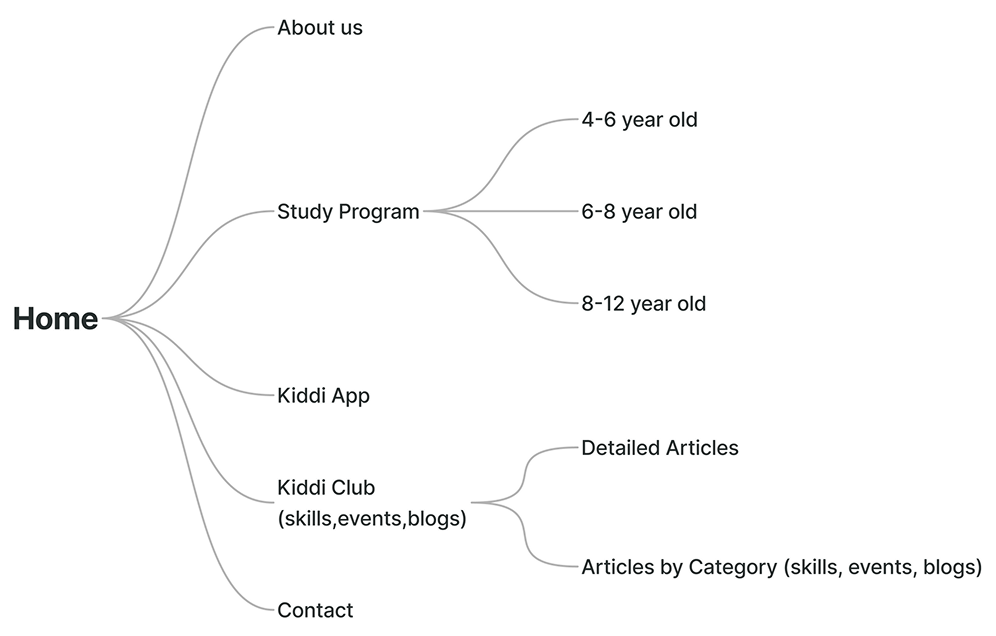
sitemap
Based on the website’s goals, I proposed a simple sitemap and aligned with the center’s founder to finalize the main pages. The structure focused on what parents need most — understanding the programs, exploring information about the center, and getting in touch.
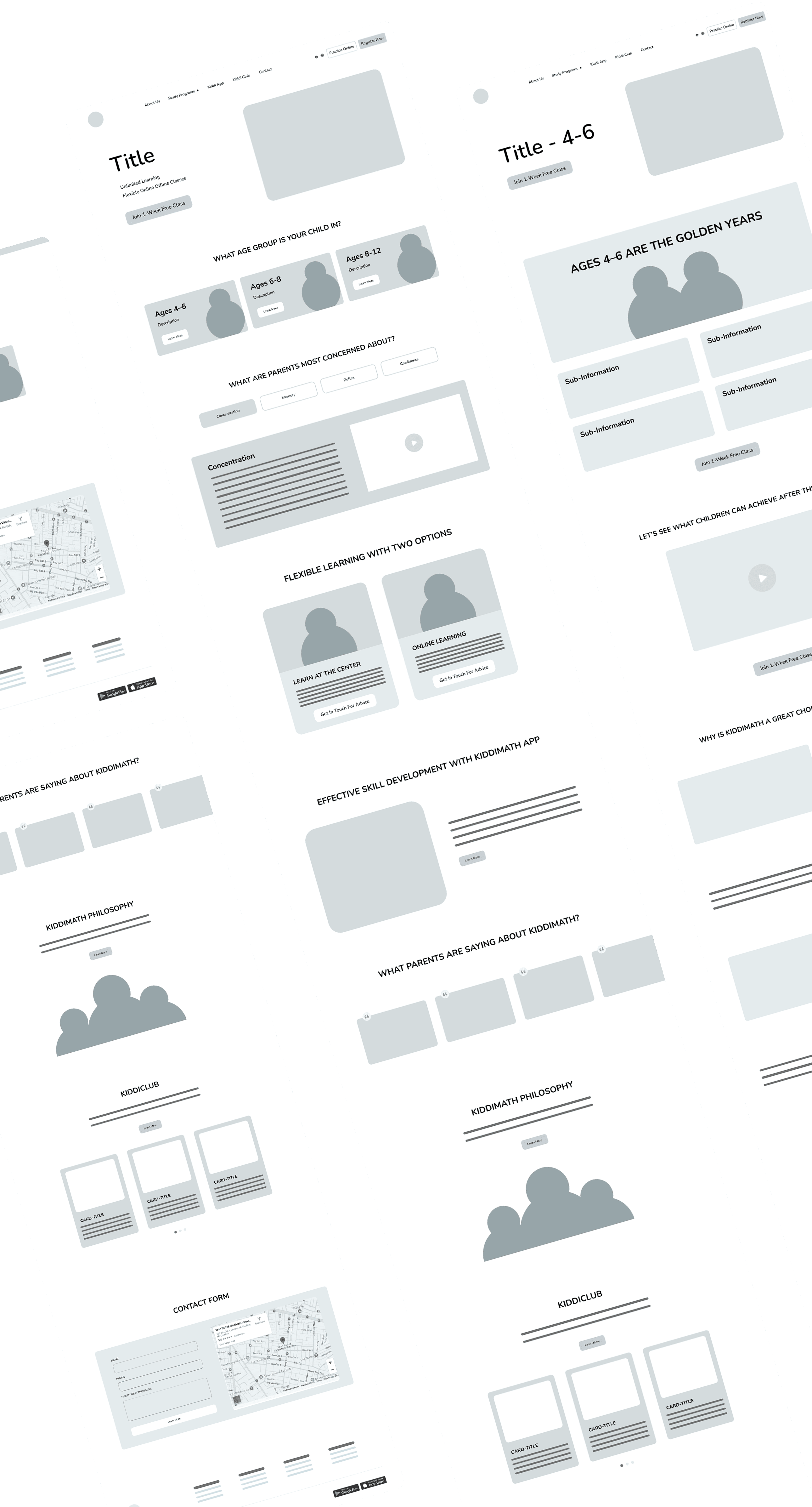
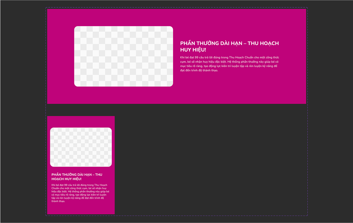
wireframe + content flow
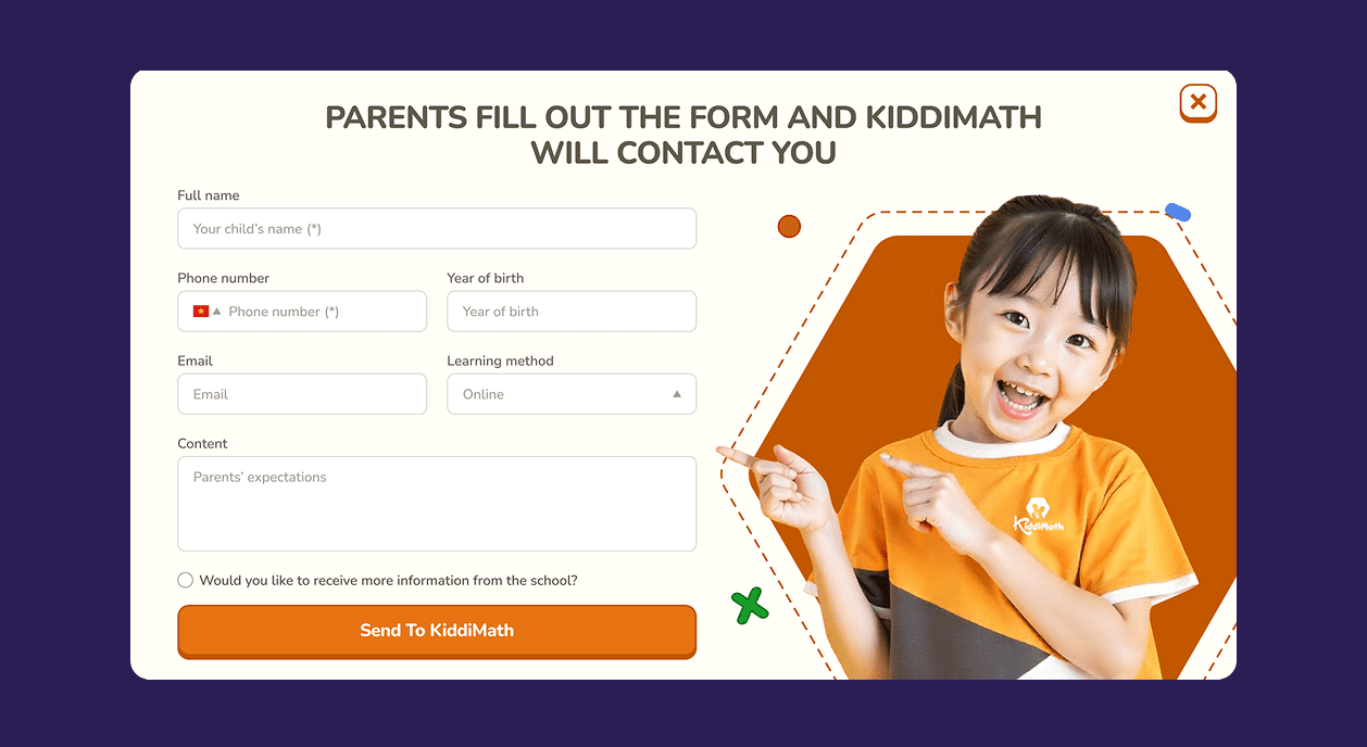
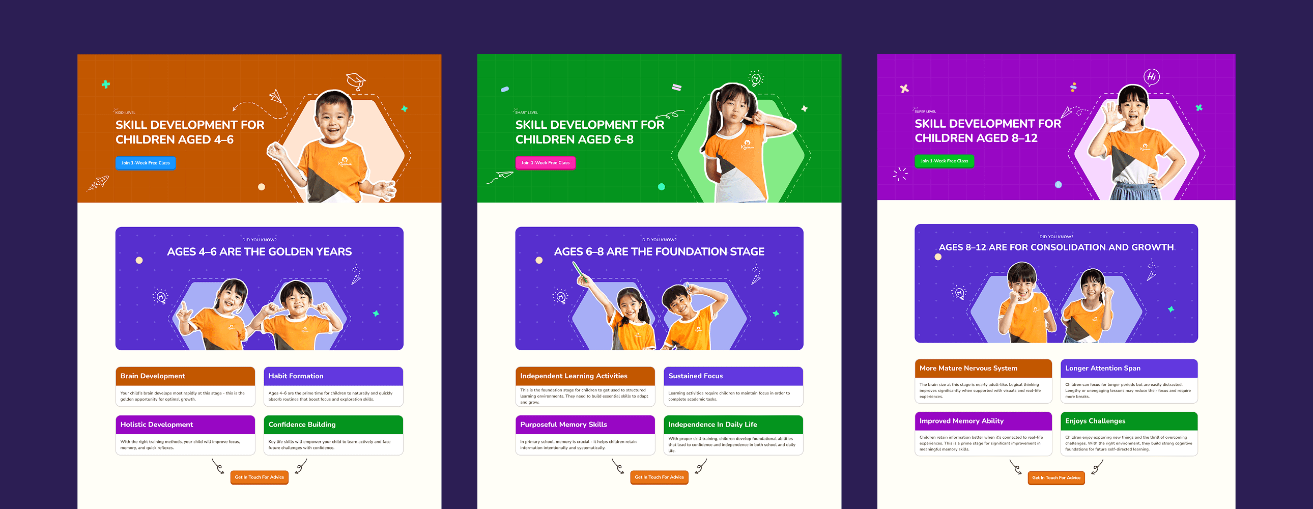
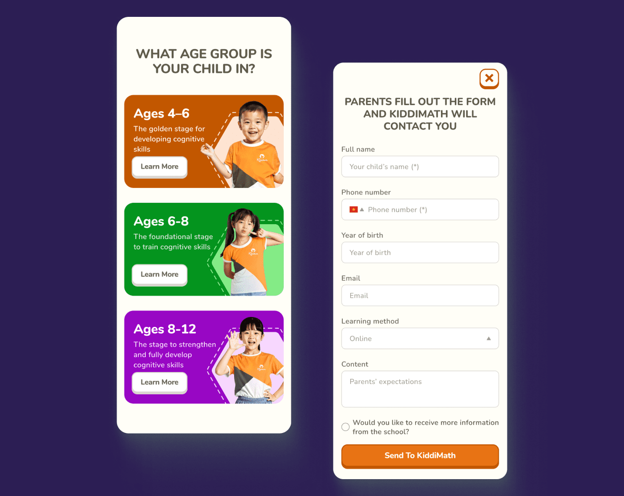
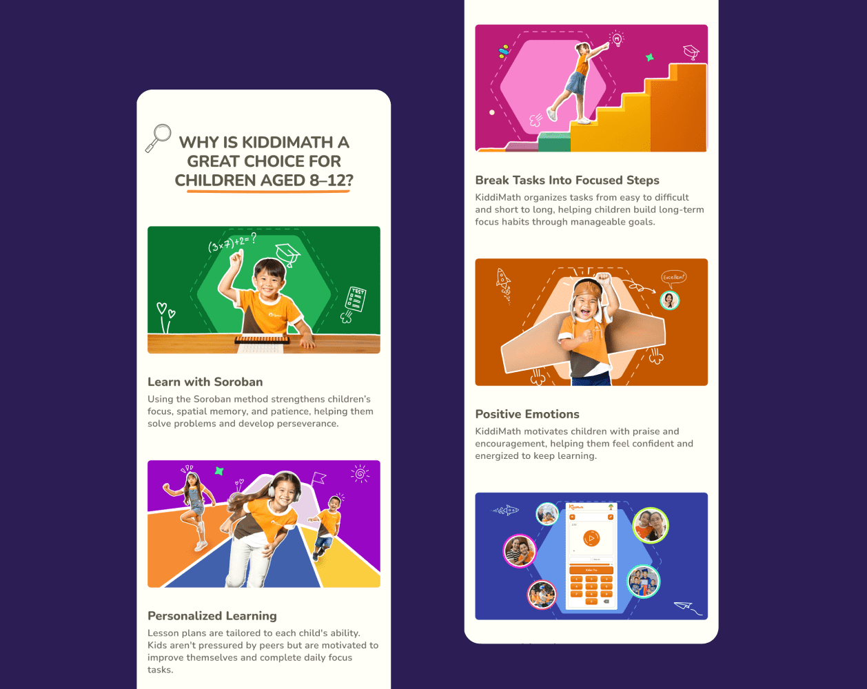
Building on the approved sitemap, I developed wireframes to define the content structure of each page. To shape this flow, I considered what parents care about when choosing a program: their child’s age, the specific skills they want to improve—such as concentration, memory, reflex, and confidence—and the outcomes their child can achieve after learning with Kiddimath. Each section was intentionally placed to guide parents through discovery, trust-building, and decision-making.
02
moodboard
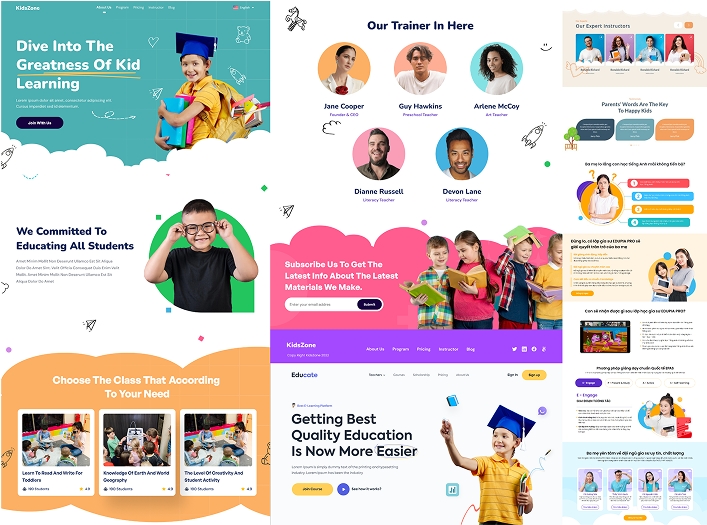
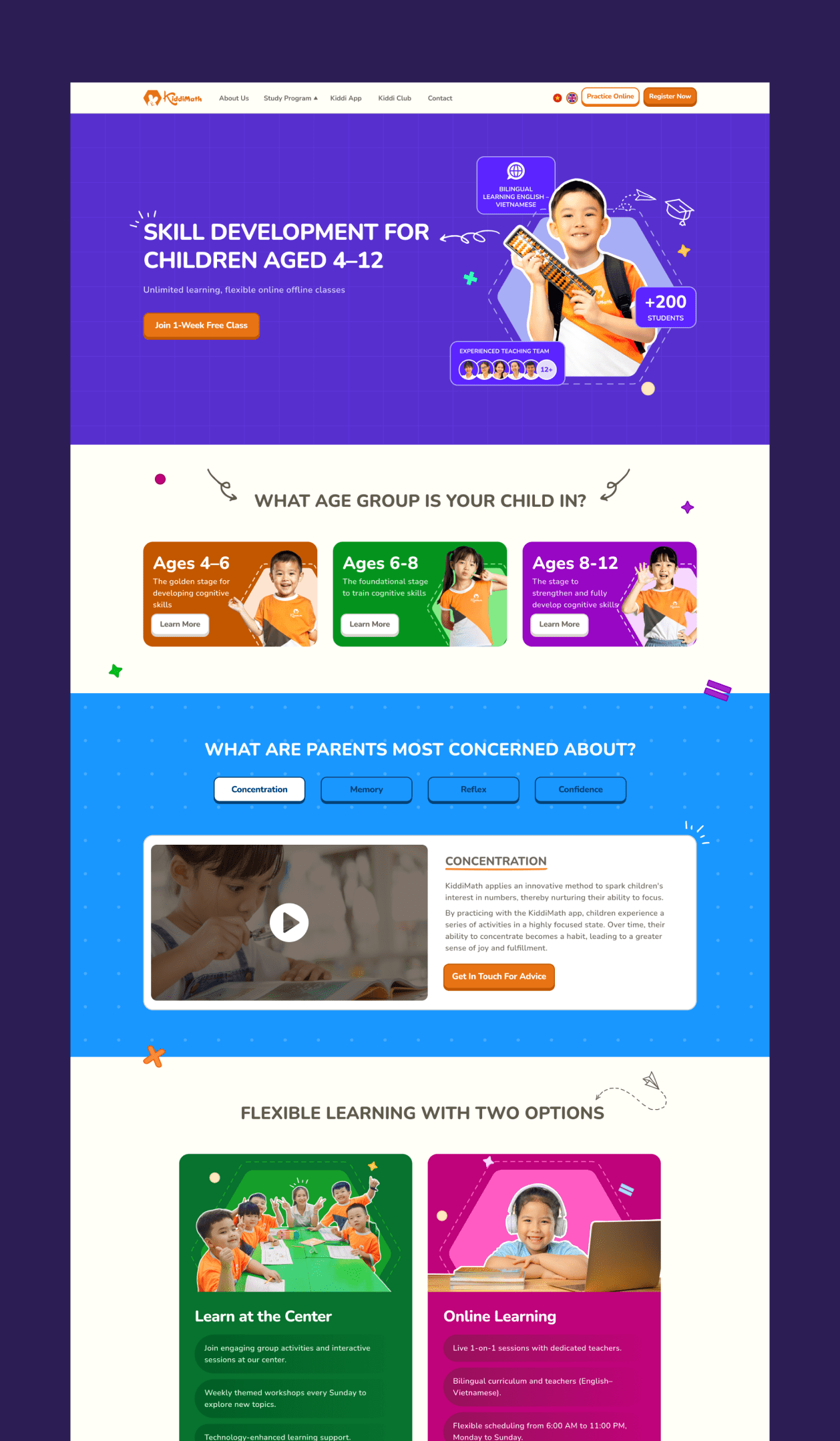
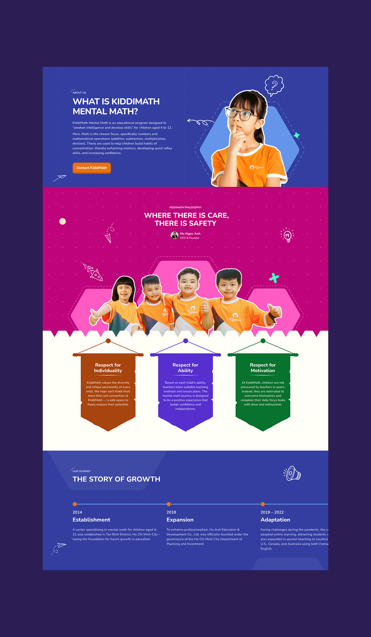
I started the visual direction by collecting references based on keywords like playful, fun, and kid-friendly. The result is a vibrant and professional style that reflects KiddiMath’s joyful learning spirit.
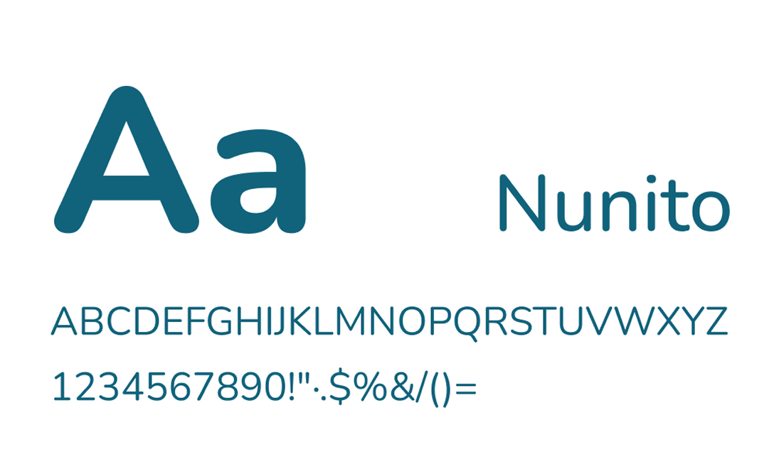
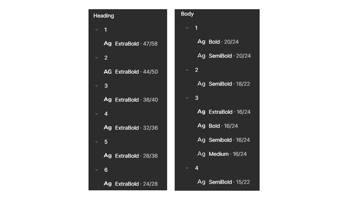
typography
I chose Nunito for its rounded, soft edges that naturally convey friendliness and warmth — making it a great fit for kid-oriented design.
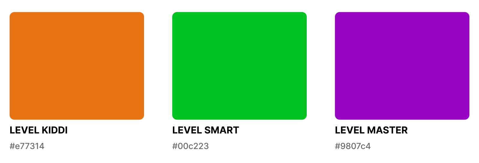
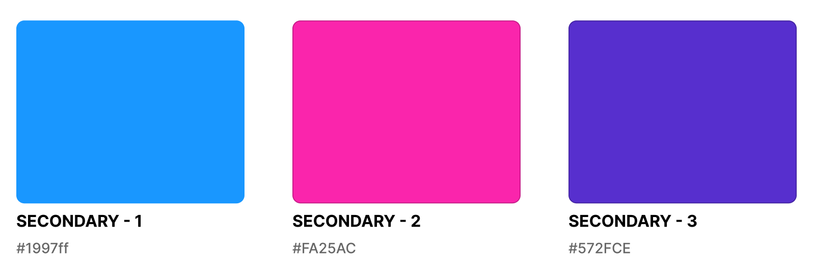
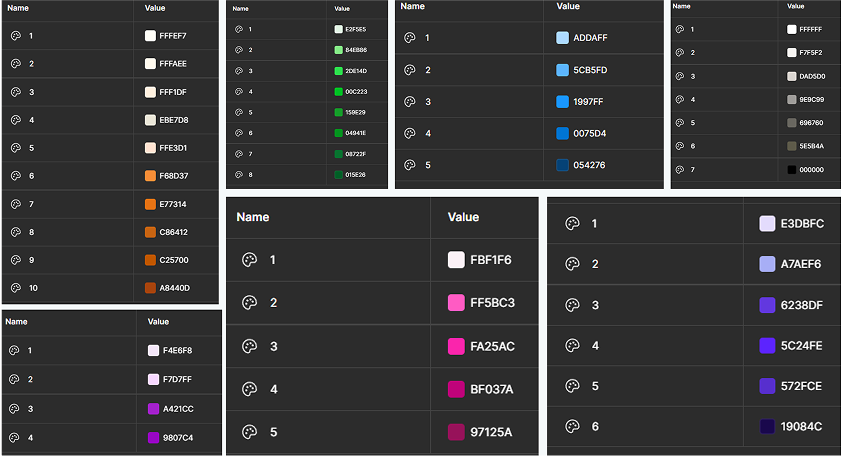
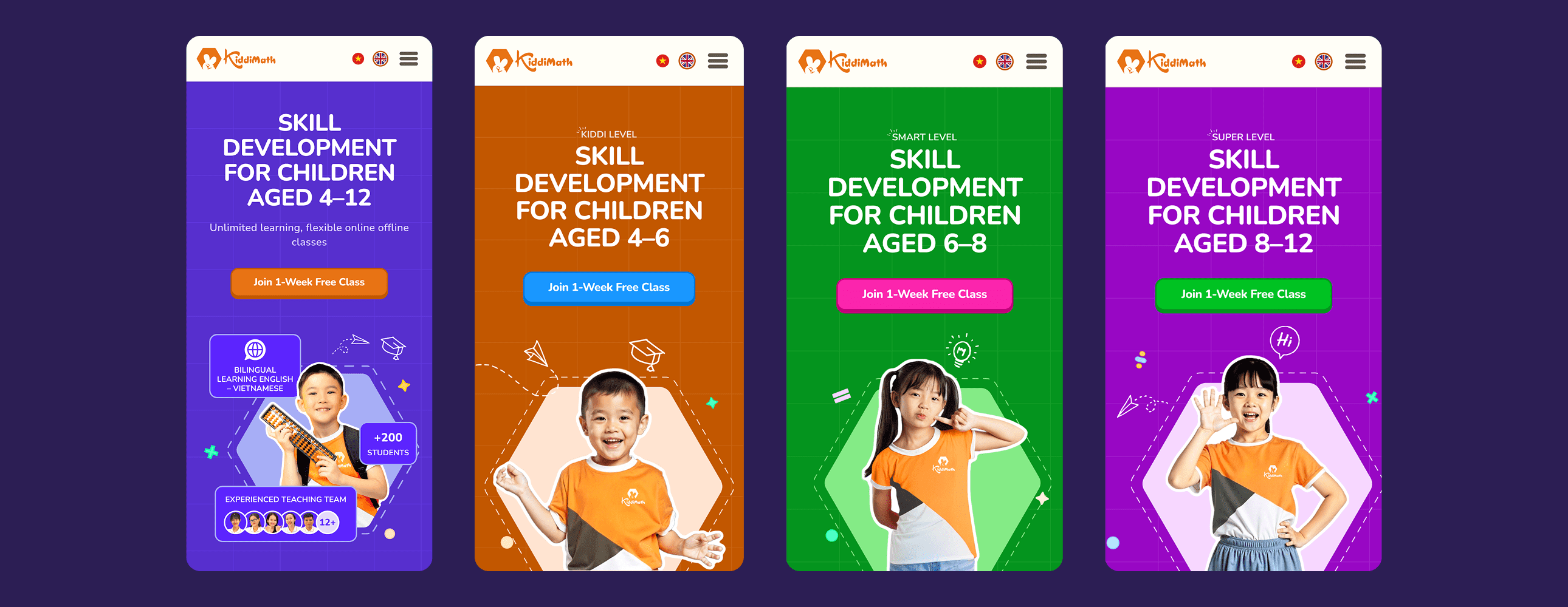
color
The primary colors were based on the existing colors assigned to each learning level — Kiddi, Smart, and Master. I then expanded the palette with additional supporting colors to bring more vibrancy and playfulness to the visual identity.


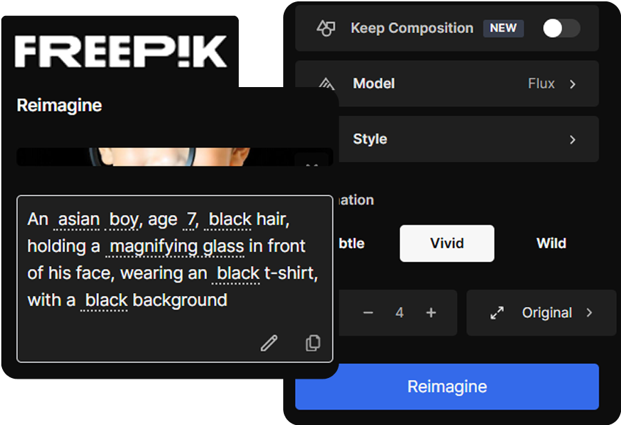
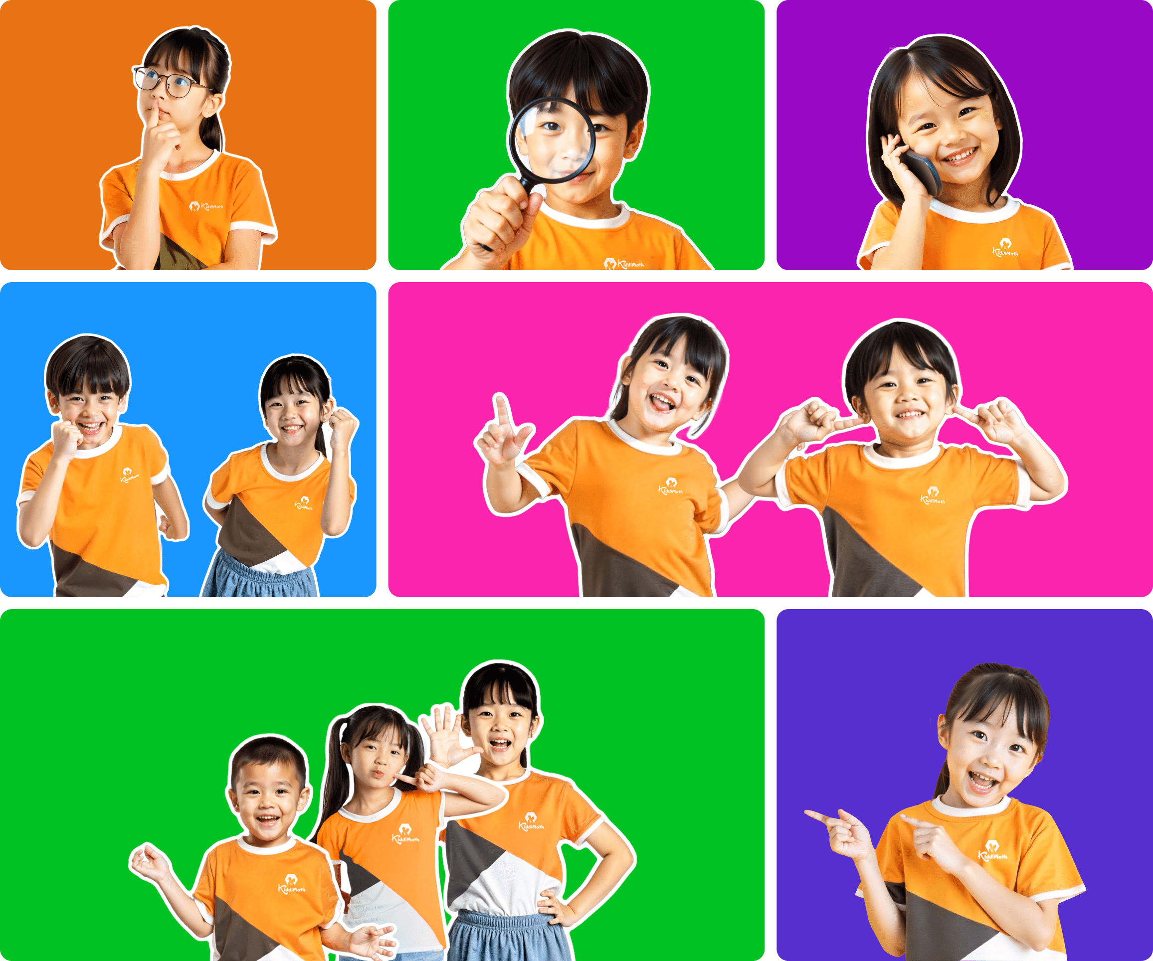
Images
Since the center didn’t have any professional photos of students, I created a custom image set using Freepik’s AI image generator. I designed each child to wear the center’s uniform and express playful emotions. These visuals — combined with vibrant backgrounds — helped reinforce the cheerful tone and kept the visuals aligned with the brand identity.
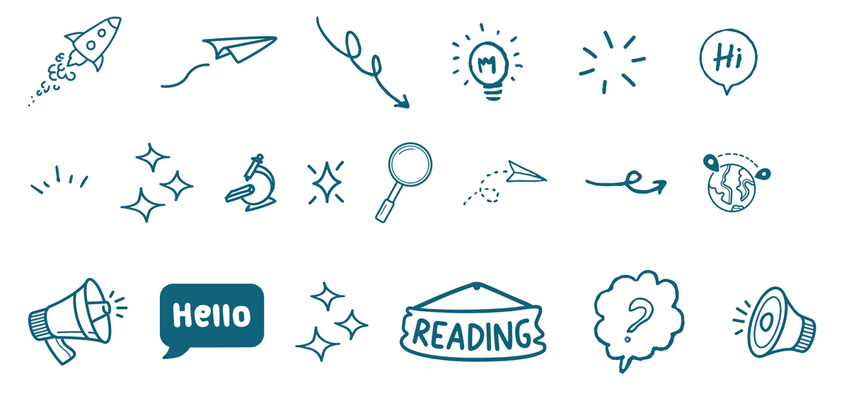
icons
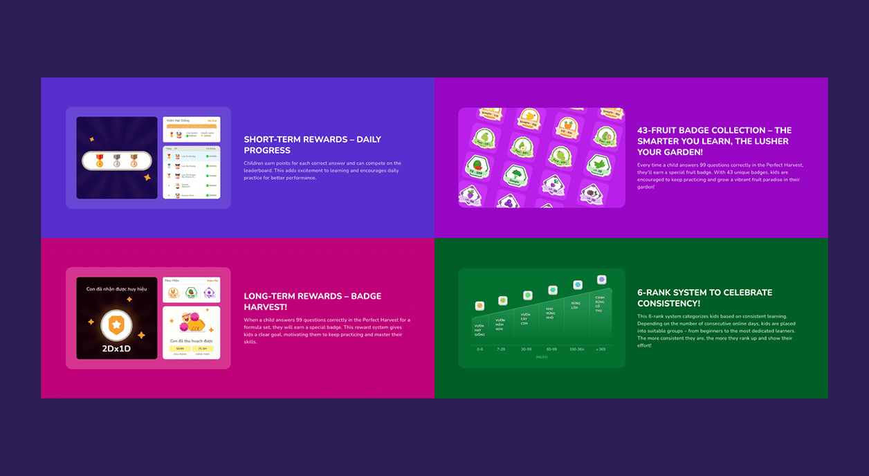
While designing, I added some playful touches with doodle-style icons and simple geometric math symbols (plus, minus, multiply, divide). These details helped make the website feel more lively and kid-friendly.

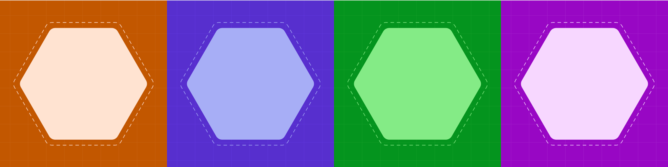
Visual Motifs
Inspired by the hexagon (soroban bead) from the logo, I repeated this shape along with dot and grid patterns to create playful visual motifs.


03
system
color & typography
Based on the core colors, I created structured palettes in Figma using color variables, while typography was organized into two main style groups: heading and body.
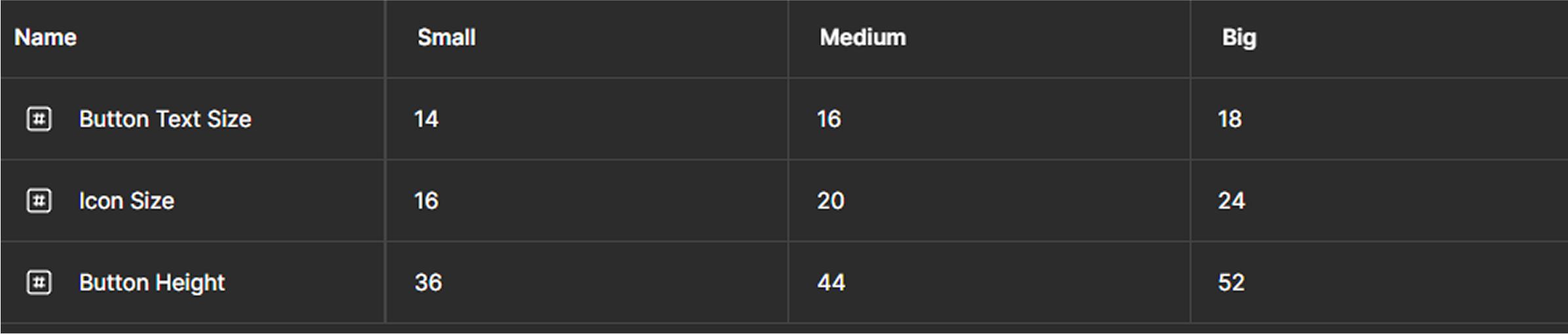
Button Sizing System
The sizes of button components—including text, icons, and height—were managed as Figma variables with three modes: small, medium, and big.
button type
I built button components using variants for interactive states and managed color changes through Figma variables with modes corresponding to each button type.

button theme
To handle color variation across levels, I created four color themes—three for the center’s learning levels (Kiddi, Smart, Master) and one default theme for general pages. Currently, the theme switching system supports the Primary button type, with the flexibility to expand to other types in the future.

other components
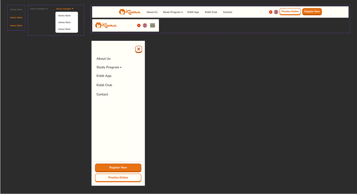
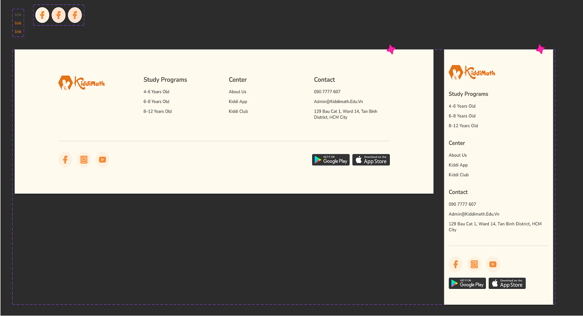
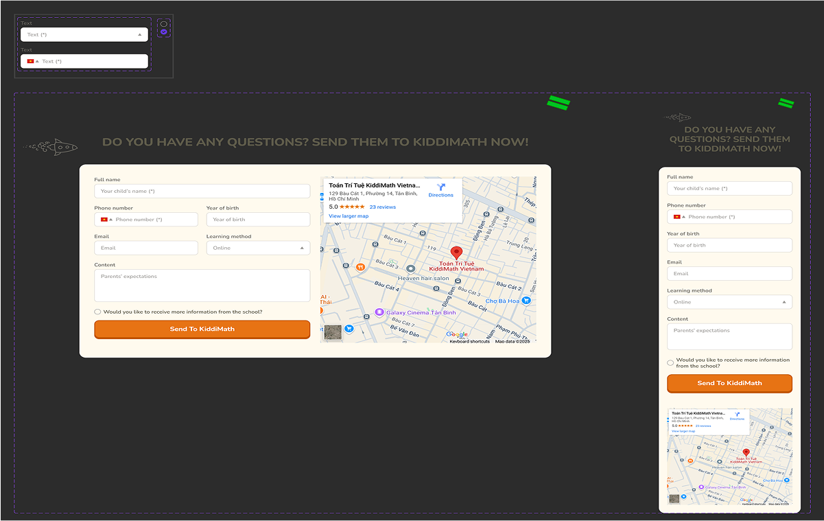
I also created additional components as part of the system, including the header, footer, contact form, and key feature sections — ensuring a consistent and reusable UI throughout the website.
04
design
05
Handoff Notes
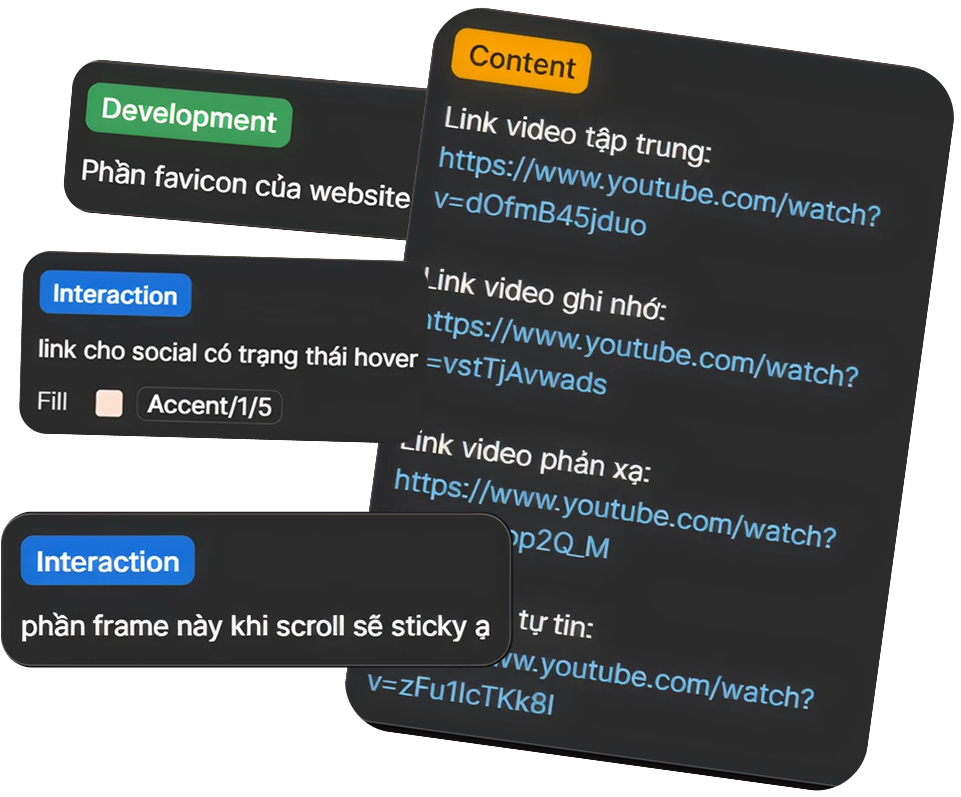
As part of the handoff process, I used Figma’s annotation feature to highlight important implementation notes—such as content references, interaction behaviors, and development details—making it easier for the developer to understand design intentions.
Post-Dev Review
After development, I used Notion to document visual inconsistencies and UI bugs compared to the original design. This helped streamline communication with the developer and speed up the debugging process.
06
steps
next steps
While the main goal was to redesign the website, the outcomes go beyond just a digital refresh. The visual direction developed in this project now gives KiddiMath a clear design foundation—one they can confidently build upon for future products and brand materials.
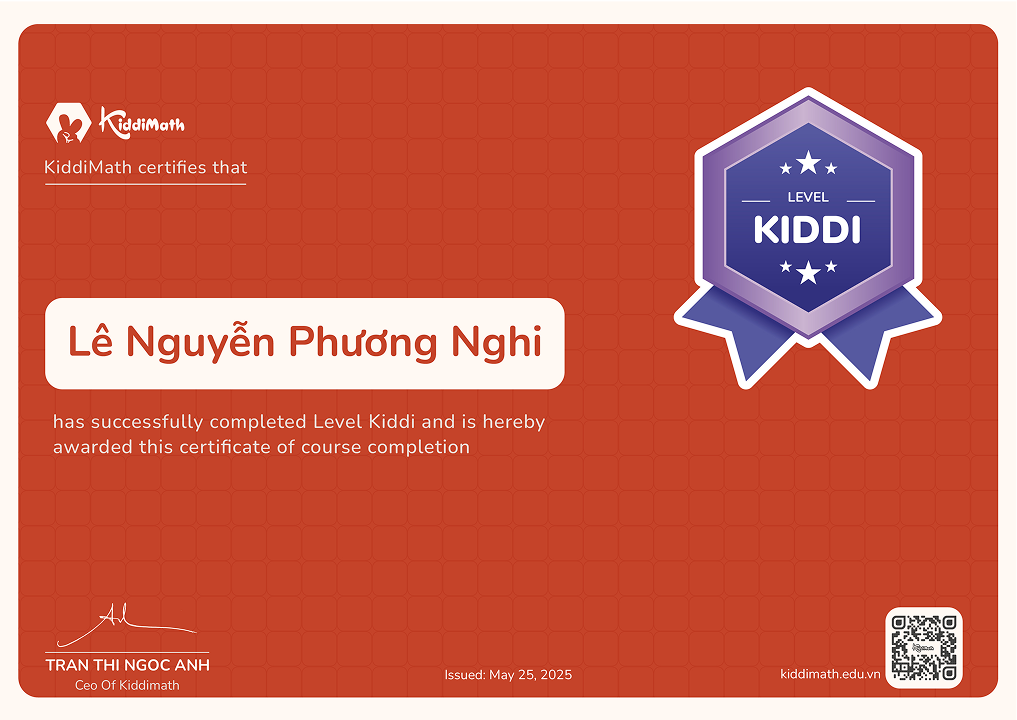
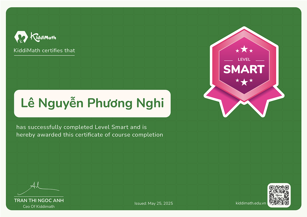
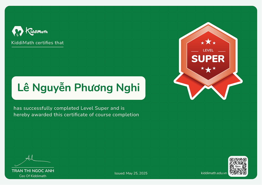
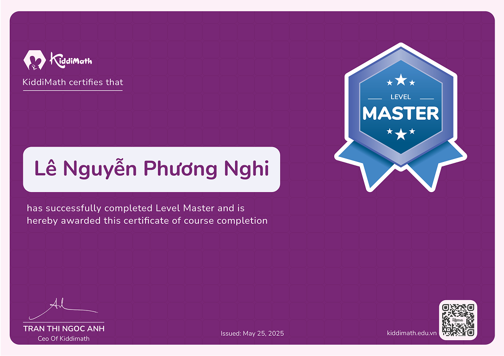
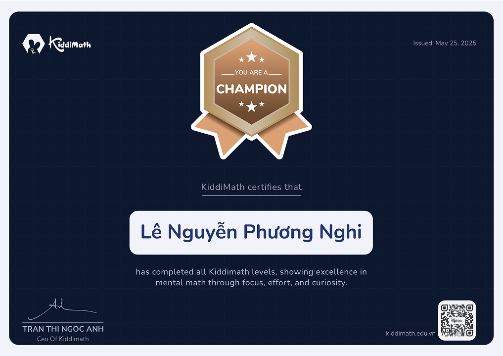
certifications
One of the follow-up deliverables I designed was a set of student certificates that extended the visual language established in the website. Each certificate reflects the playful tone, color-coded levels, and brand consistency—making the recognition experience fun and memorable for kids.
Learning 01
A strong visual system still needs the right people
In this project, I delivered a clear visual direction that the center could use for future materials. However, I failed to anticipate a critical gap: they didn’t have anyone with design expertise to continue the work.
The owner expected their internal staff—someone who knew how to use design tools but prioritized quick templates—to be able to replicate the same quality and consistency. As a result, the follow-up materials didn’t align with the original visual language, which broke their expectations.
Looking back, I should have had a clearer conversation with the owner to explain that while a strong system was in place, it could only be effective if maintained by someone with the right skills. This helped me realize the importance of setting realistic expectations based on the team’s actual capabilities.
Learning 2
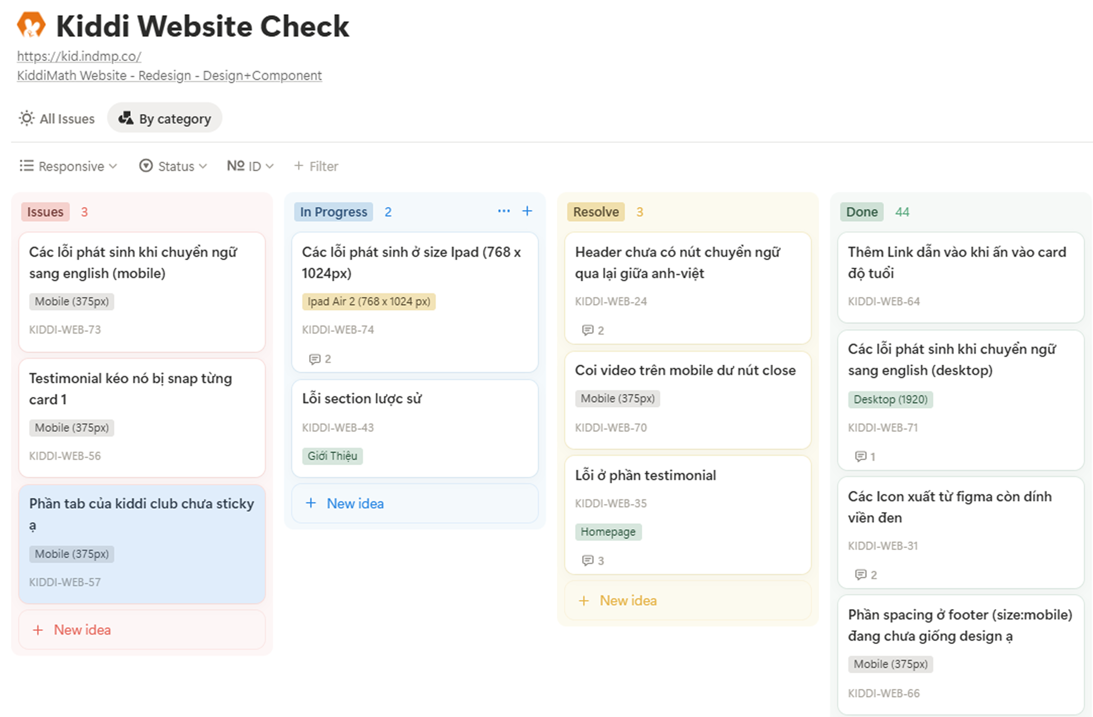
Learned a Simple QA Workflow for Design Review
After the development phase, I realized that the final UI differed noticeably from the original design - likely due to implementation shortcuts or missed details. Since KiddiMath didn’t have an in-house developer, they worked with an outsourced team, and communication was mostly through Zalo.
Giving feedback via chat quickly became messy, with issues getting lost or repeated. To fix that, I looked into how others manage design QA and found a simple post-dev workflow. I adapted it into Notion, using four clear stages: Issue - In Progress - Resolve - Done.
Applying this structure helped me track feedback more clearly, follow up with devs efficiently, and maintain better alignment between design and the final product—even when working remotely.